One of the first things guests may notice at a wedding is the colors. Have they just arrived at a traditionally elegant affair with whites and golds, or did they step into a more contemporary wedding with purples and blues? The wedding color palette is an important part of the event’s theme, and it has the potential to take a good bit of the spotlight. It’s for this reason that it needs to be cohesive. Not only that, but it needs to mean something to you, the couple-to-be.
Whether you’re planning a rustic party, chic modern event, or a timeless celebration, visuals matter. In this blog, we’re going to dive into how to choose wedding colors that will serve your big day perfectly!
Start With Your Vision and Venue
Don’t dive into the Pinterest boards just yet. Begin with the big picture. What are you drawn to? Modern minimalism? Woodland greens? Coastal blues? The theme you want to go with will lend itself heavily to a certain wedding color palette over others.
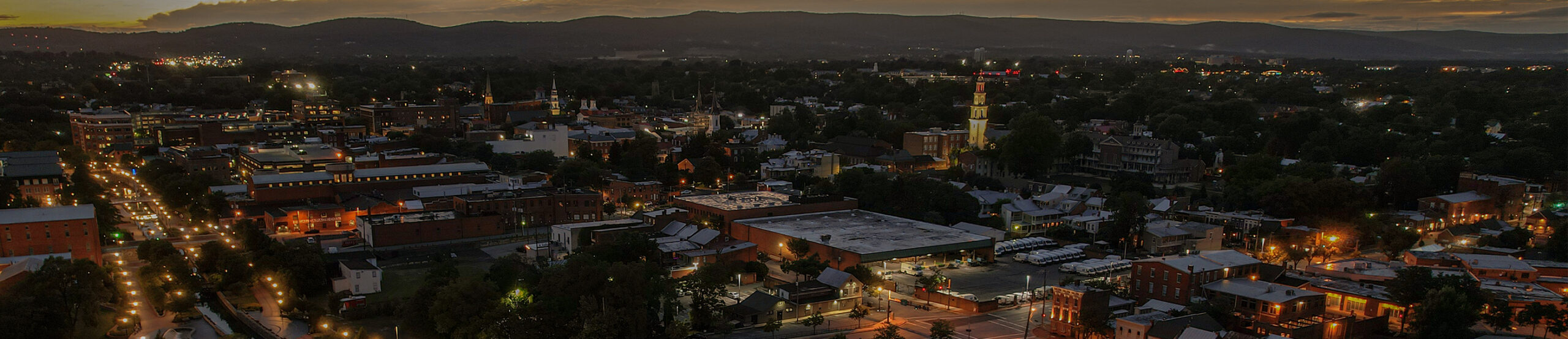
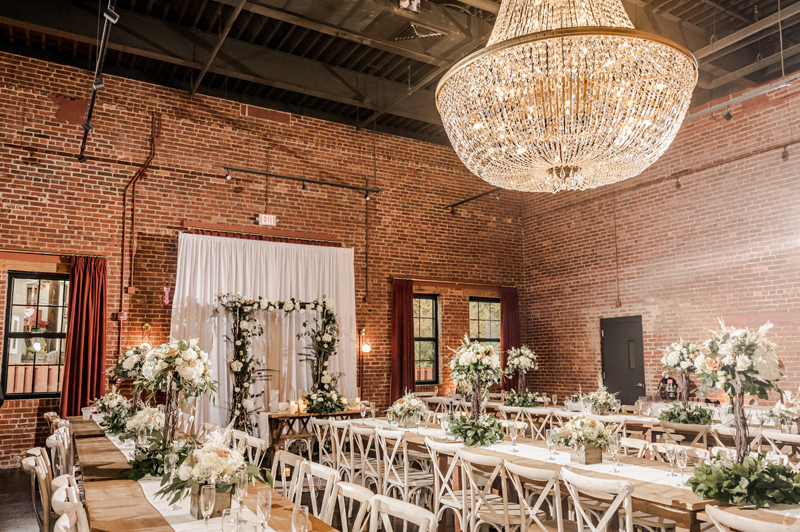
Then, of course, there’s the venue to consider. No matter how versatile the space is, it can’t fit every theme imaginable. As an extreme (yet very fun) example, Union Mills Public House may not be the best location for a space-themed wedding. The chandelier and bricks probably wouldn’t be found on a starfaring shuttle. But we can adapt to several more down-to-earth themes.
Essentially, you should consider a venue’s architecture, surroundings, and lighting when selecting the best wedding colors for the occasion. Let the space guide you, but don’t lose sight of your own preferences!
Use the Season as Inspiration
Seasonal palettes are timeless. After all, it’s not like fall, winter, spring, and summer will ever go out of fashion. More than that, though, a seasonal theme will play right into the flowers, textures, and lighting that are all naturally a part of the world during your wedding month.
- Spring: Soft pastels are the main colors here. For flowers, think peonies and tulips.
- Summer: Vibrant, bold colors are the name of the game. Corals, fuchsias, and sunshine yellows can make for a truly colorful, summery celebration.
- Fall: Earthy tones like burnt orange and terracotta are a defining feature of fall, as they reflect the cozy vibes of the changing foliage.
- Winter: Cool blues and sparkling silvers get the highlight during the season of freezin’. Don’t worry, though; Union Mills Public House has a great heating system to combat the cold.
Choose a Primary Color and Build Around It
So you’ve decided on a general direction for your theme. Now it’s time to select the “foundation” of your wedding color palette. Once you choose a primary color, you can build around it by layering in tones that support it.
Think of complimentary colors that provide contrast, analogous colors that provide a bit of harmony, and neutral colors like white to give some balance. And finally, consider an accent color that becomes a defining part of the theme without overstaying its welcome.
Generally, a good palette features three to five colors. This will allow variety without becoming overwhelming.
Keep Practical Elements in Mind
Have you ever made a purchase because it looked really cool, only to discover it was underwhelming or simply didn’t work out in the real world? Wedding planning is a combination of creativity and logistics. Will your colors work in a true setting rather than just on a mood board? Will they even be possible to achieve?
Consider these things:
- Bridesmaids dresses: Will the shades you’ve selected be flattering to your bridal party? Will they be easy for designers to match?
- Floral availability: Certain flowers don’t come in certain colors. On top of that, the flowers you want may be expensive or outright unavailable, depending on the season.
- Decor costs: Even if you have a bold vision for your theme, the cost of certain items may put a damper on your plans. Specialty linens and other decor items with unique colors may carry a hefty price tag.
- Photography: Colors can photograph very differently in natural lighting versus indoor lighting.
- Venue lighting: Wedding decorations can appear different depending on the type of lighting they’re being illuminated by (candlelight, uplighting, windows, etc.).
Try a Color Palette Tool
Starting the color selecting process can often be the hardest part. Luckily, there are plenty of digital tools available to help you out! Pinterest, Canva, and Adobe Color are a few such tools that allow you to generate palettes that will work in harmony with other aspects of your wedding.
Once you narrow down your choices, have a little fun and test your colors out in the real world! Gather fabric swatches, ribbon samples, stationery mock-ups, and small flower arrangements to see if the wedding color palette you’re eyeing truly lives up to your expectations.
Don’t Be Afraid to Break the Rules
All that said, we’re going to throw a little curve ball at you: Break the rules! Trendy and traditional colors certainly look good, but greatness is rarely achieved by staying in step. When it comes down to it, how to choose wedding colors is up to you. Throw a wild color into those pastels. Make it bolder than anyone could have imagined. Non-traditional palettes have the potential to create the most memorable and personal weddings. You’re the creator!
Choose the Best Wedding Colors for You!
Your wedding color palette is the stage-setter for your celebration. It’ll be on full display everywhere your guests look, from the bridal party attire to the table centerpieces. By being diligent and testing your ideas before the big day, you can establish a visual identity that will make your big day truly special.
At Union Mills Public House, we offer a surprisingly versatile setting that can adapt to various themes and palettes. Complete with a staff that knows how to make such a momentous occasion run smoothly, we’ll make sure your big day is one to remember for all the right reasons. Get in touch with us and let’s schedule the beginning of your happily ever after!